
I’ve been part of an Information Design team for about 3 years at Merkle. We help different teams around the world present their content in the best way possible, coming up with new formats and trying different types of software for this purpose.
To be able to deliver consistent results on time and make other teams shine, we work with various design systems. I’ve been in charge of setting up and organizing the design systems we use the most (currently on Figma and Figma Sites) during my time at Merkle. Since most of the content we’ve worked with is confidential, here’s a peek into my design process 🙂

Our target audience
Sales teams from different companies and industries
Decision makers in power positions
Marketing teams
Visitors and savvy users in tech events
User needs
For our team:
Scalability
Adaptability to different brands
Flexibility and modularity
Ease of use
Reliability
For marketing teams:
Ease of use, during and after the design process
Flexibility to allow different types of content, depending of the need
Personalization
functional requirements

The user should be able to handle the presentation given with a regular mouse and keyboard
The user should be able to add information using platforms already known to him (Microsoft Office tools, most of the time)
The designer should be able to personalize every part of the presentation interface depending on the brand he’s working with
The designer should be able to add custom pieces to the design system as needs and requests come
methodology
Since this was my first time setting up a design system and my team was not adapted to Figma yet, I started researching how different design systems were setup in other companies. We had an old presentation template in Adobe XD that served as a starting point to know which pieces we needed to build, though it was not optimized or set up taking advantage of all the features available in the software.
Understanding each part of the system and creating the template
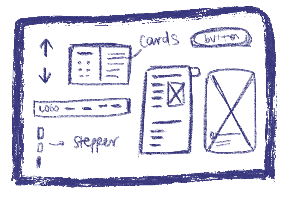
I classified all the parts of the existing template based on their location in the page and specific function: Global and specific navigation, content area (placeholders for body copy, illustrations, mockups and other resources) and technical information, when the theme required us to.
Based on the components previously catalogued, we created all the main files needed to build the templates taking into account dedicated font files, color palette files and variables, and the setup of a light and dark theme using Figma’s variables. The components were built and so were the template files, having different design patterns setup as well flexible enough to be customized according to different brands.
Testing and iterations
We created a test presentation and set up an intake file to gather all the information from our internal users — the marketing and sales teams. With their direct feedback and the way we saw them interact with both the template and the intake file, we started making changes.
What were the biggest changes during the first months using the new system?
We changed the visual template of the intake file, since we realized most teams were most comfortable working in spreadsheets.
We changed the way some of the pieces fit in the file, making personalization easier. We had more custom template requests than what we were expecting.
We improved the animations by setting up templates for this as well. Creating animations was time consuming at first and we realized we needed to create components to streamline it.
current state
After more than 2 years working on the design system, we’re on version #5 and still working on it. We also launched a second design system to build microsites, based on the components built for the presentation design one. Moving forward, we will continue making new components and making improvements with the new features continuously released by Figma. As of now, we’ve built more than 60 presentations and sites for teams located in all continents and all sorts of industries.
— final thoughts
I’ve really enjoyed working on this design system because on the way I realized I’m good at organizing information, which is something I didn’t use to relate directly with the design process. It’s also rewarding to be able to test a set of components for a long time and for so many use cases, I can see the growth and improvement of the system. Knowing I can build tools to make my day easier while mastering a new skill —testing tools as Figma Sites in the real world— and helping my team learn as well is my favorite part of this ongoing project.
