Cornershop is an app that allows users to order products from different supermarkets and have them delivered to a selected address. For this challenge, Cornershop wanted a proposal of a dashboard that would allow the operations team to know about any changes on placed orders related with unavailable products in the stores. When a product is not available, the shoppers should be able to notify the customer and propose a different product as a replacement.
Cornershop es una app que permite a los usuarios ordenar productos de diferentes supermercados y recibirlos en la dirección que deseen. Para este reto, Cornershop quería una propuesta de dashboard que permitiera al equipo de operaciones saber sobre cualquier cambio en órdenes relacionadas con productos no disponibles en tiendas. Cuando un producto no está disponible, los shoppers deben poder notificar al cliente y proponer un producto diferente a cambio.
⭐️ Tasks
- Design a dashboard that would allow the person in charge of operations visualize the state of all orders. He must be able to see if there are changes or cancellations.
- Design the screens the shopper would need to let the customer know a product is unavailable and propose a different one.
Strategy
Having this in mind, I divided the different users that would be involved in the mentioned tasks and made a list of requirements each would have.
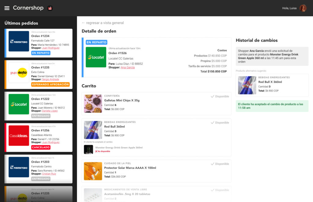
The Dashboard
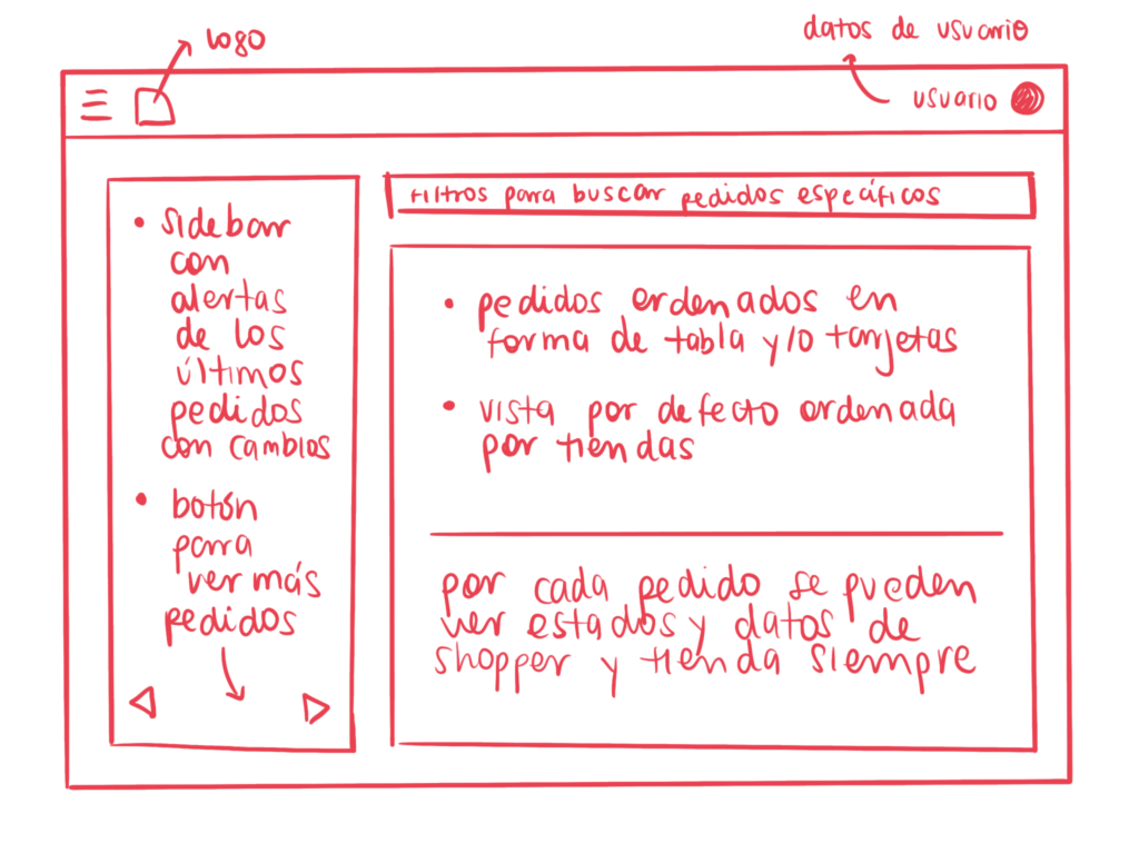
What would the operations team need to know?
- The global state of all orders
- Orders that have had any changes
- Orders that have been cancelled
- Filter orders by store, price, shopper, client
The app screens
What would the customer need to do?
- Get notified when a product is not available
- Communicate if he accepts the change proposed to the order by the shopper
- Communicate if he does not accept the change proposed to the order by the shopper
What would the shopper need to do?
- Notify the customer that a product is not available
- Inform the customers alternatives for a product that is not available
🖍 Design Process
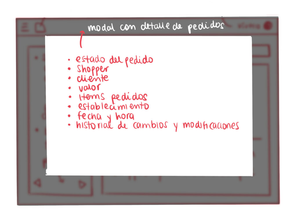
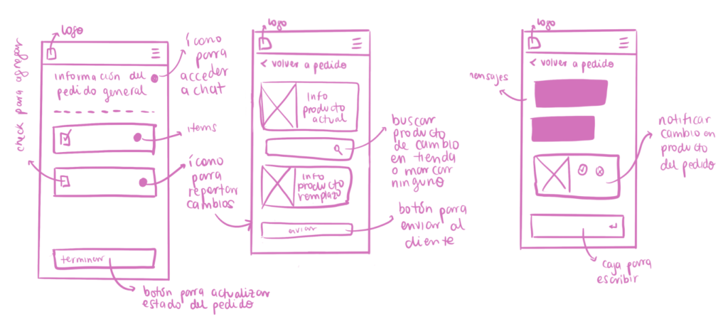
To have a broad idea of how the content would be distributed in both the dashboard and the app screens, I sketched the general layout of the screens and which kind of content would go where.
Dashboard
App screens
📐 Wireframes
I created a series of wireframes to assign a position to the elements I added in the sketches first.
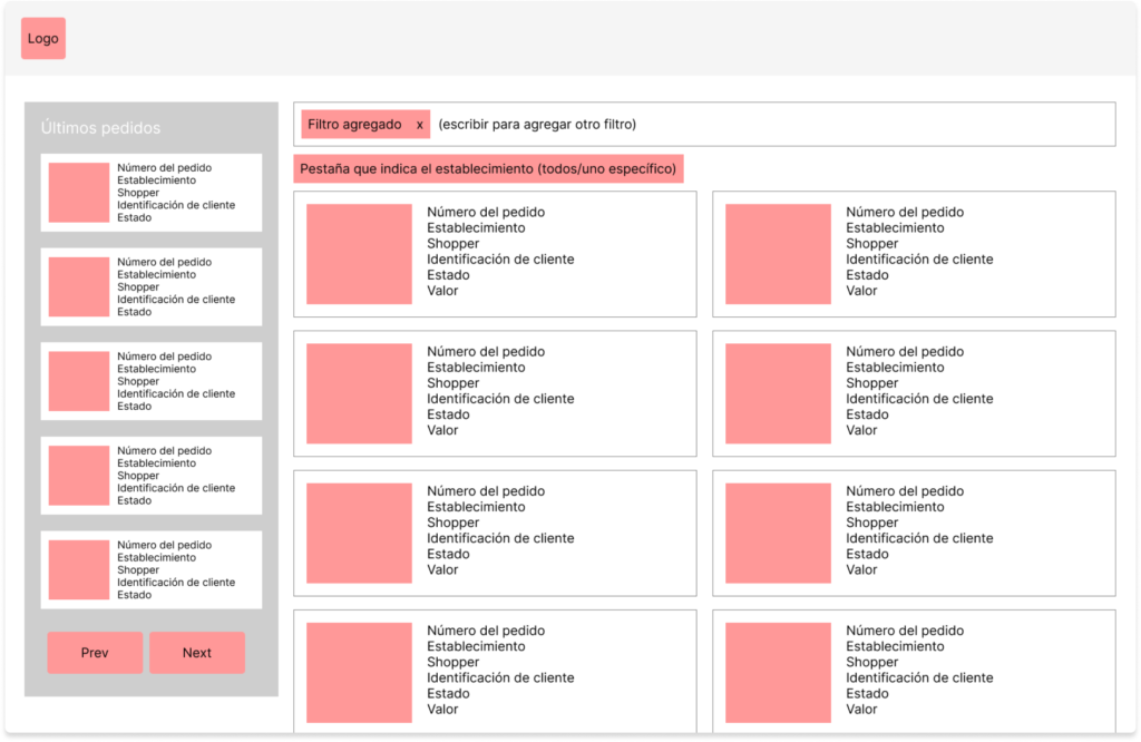
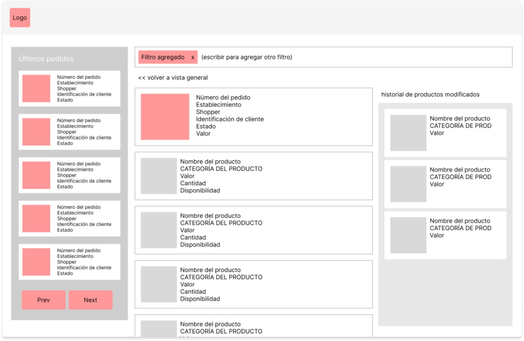
Dashboard wireframes
App wireframes
✨ Proposal
Dashboard
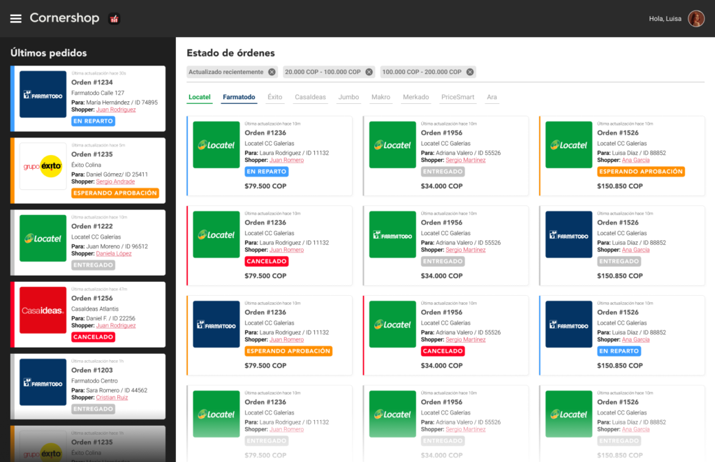
The operations dashboard has two main content areas: The latest orders column and the general orders area. Both share the same kind of card layout to showcase orders. This layout contains general information about each order and highlight color signaling the state of the order.
Order details
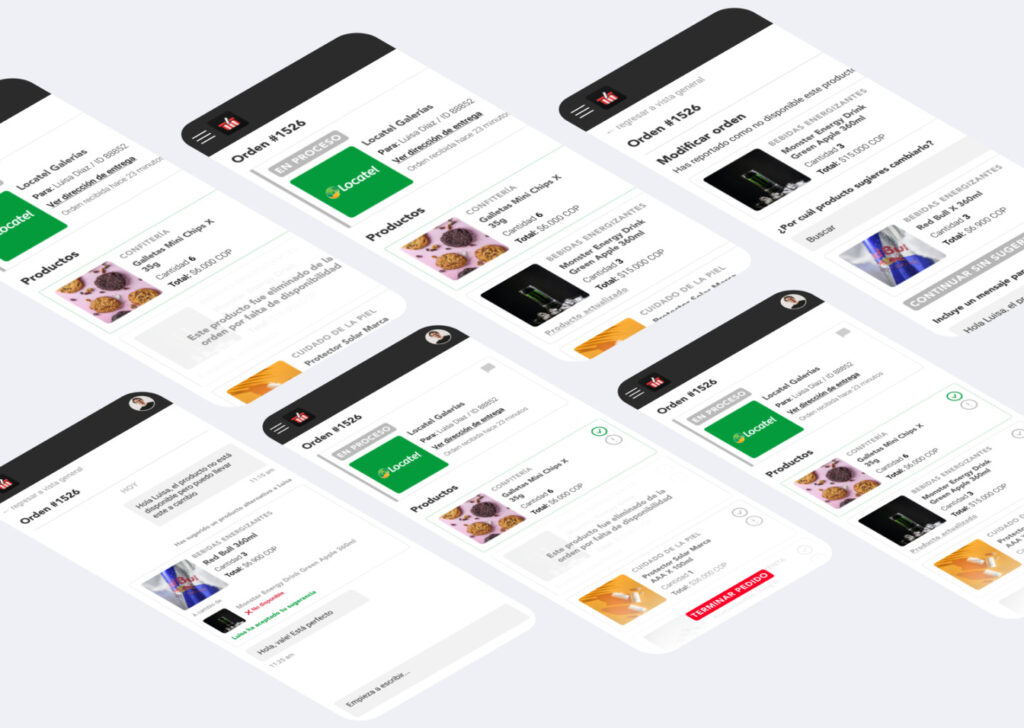
When clicking on an order, the user would be taken to the order detail screen, showcasing all items in the order and information about any changes made.
App screens
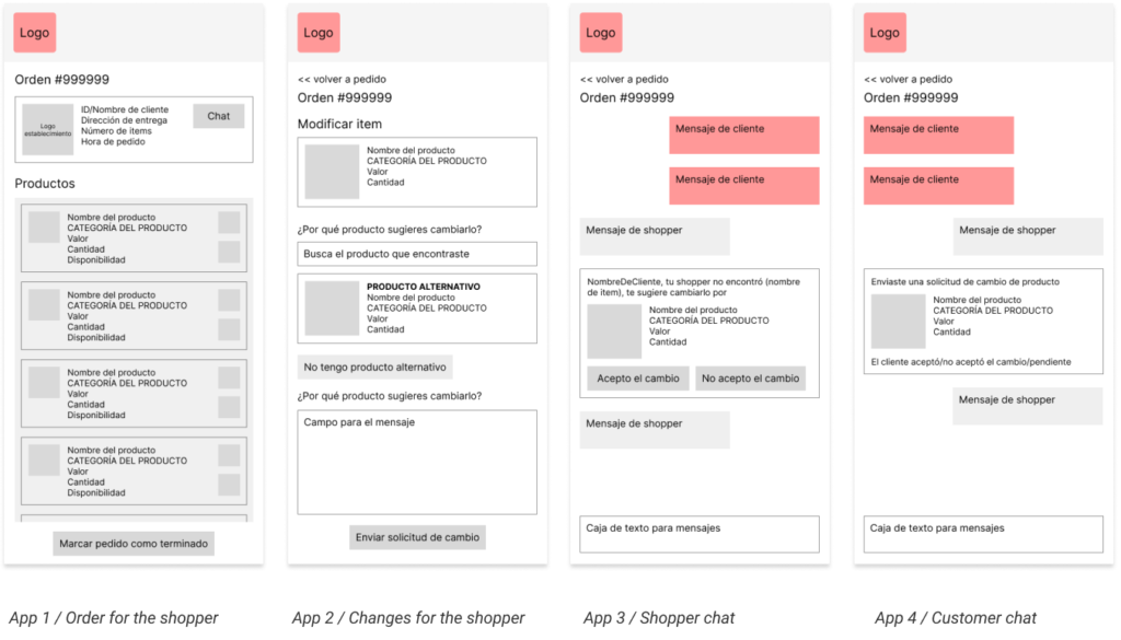
The shopper would have a screen that showcases the full order, where he can select any item that needs a modification. Then he would be taken to a screen where he would be able to add an alternative product from the store that is available, instead of the original one, adding a message to notify the customer.


Communication with the shopper
The customer would receive the shopper’s update in a similar set of screens, allowing him to accept or not the order changes


Communication with the customer
To inform the customer about the order changes, there would be a chat in the app with a set of buttons that would allow the user to agree or not to the proposed product changes


Shopper order information update
Depending on the customer’s answer, the shoppers’ app would show the updated product. If the suggestion was accepted, it would signal the product was changed. If the suggestion was denied, it would signal the product was deleted from the order.
🧨 Conclusion
Working on this challenge was really interesting because I was faced with different users that would have to access the same kind of information, but in really different ways. This allowed me to create a story line in my mind that made sense, building the screens according to how the user journey would develop and imagining different screens needed according to how the users made choices.